Data gathering experience design
Belcorp ·
Building analog voting interactions to unlock truthful answers and insightful data for product R&D
- Analog data gathering
- Experience design
- Data visualization

- Role
- Product experience designer · Facilitator · Information designer
- Timeline
- Q2 2022
- Team
- 1 Graphic designer · 1 Storyteller
- ParticipantsWomen participating to each round of surveys
- 65
- Positive experience reviewRecurrent participants who rated the experience as more engaging
- 88%
Empathetic surveys lead to insightful data
Belcorp, a beauty products company, conducts surveys on each of its releases. However, the participants get tired after a while and answer whatever comes to their minds. We designed the interactions for data collection and the pitch to involve the audience during the whole survey. We also visualized the results in an operable way, so Belcorp team could use the user research as internal data for their R&D program.
What if new voting interactions could unlock more genuine answers on survey respondents?
Approach
A Compelling Story
The event started with a talk to reflect on the great value of their opinion and how it echoed the voice of their friends, their mothers, their daughters, their grandmas and even their neighbors.
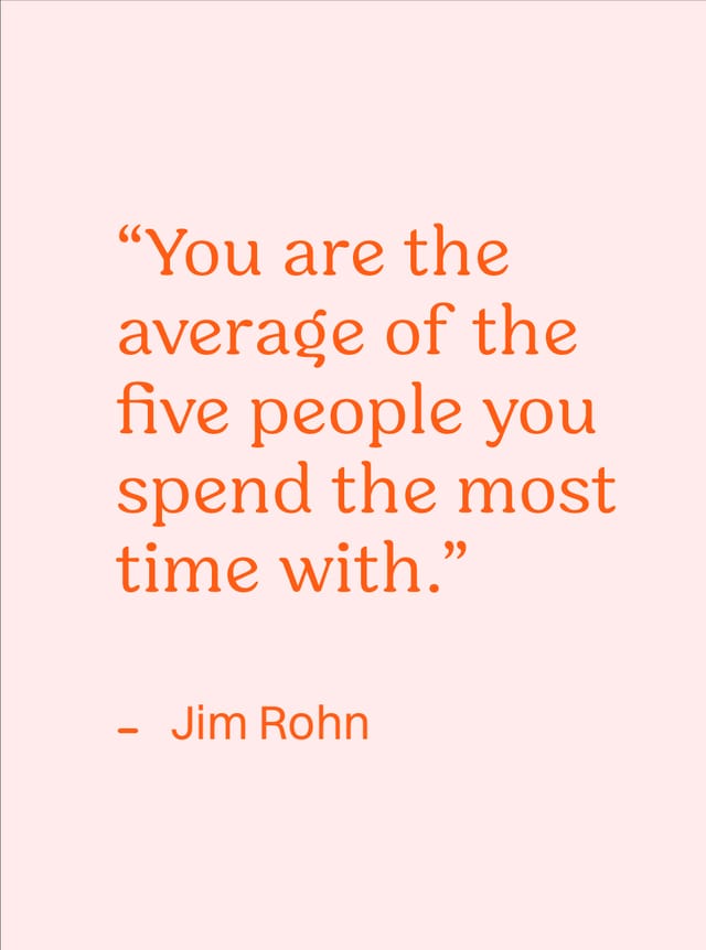
Jim Rohn's quote
Event visual concept


Ingredient 02
A Designed Environment
We set a welcoming room with colored lights, interactive data collection devices and positive messages so women stayed focused for the entire survey.

Ingredient 03
Data Collection Design
We designed 3 types of interactions to give rhythm to the session and collect more valuable data - both quantitative & qualitative.
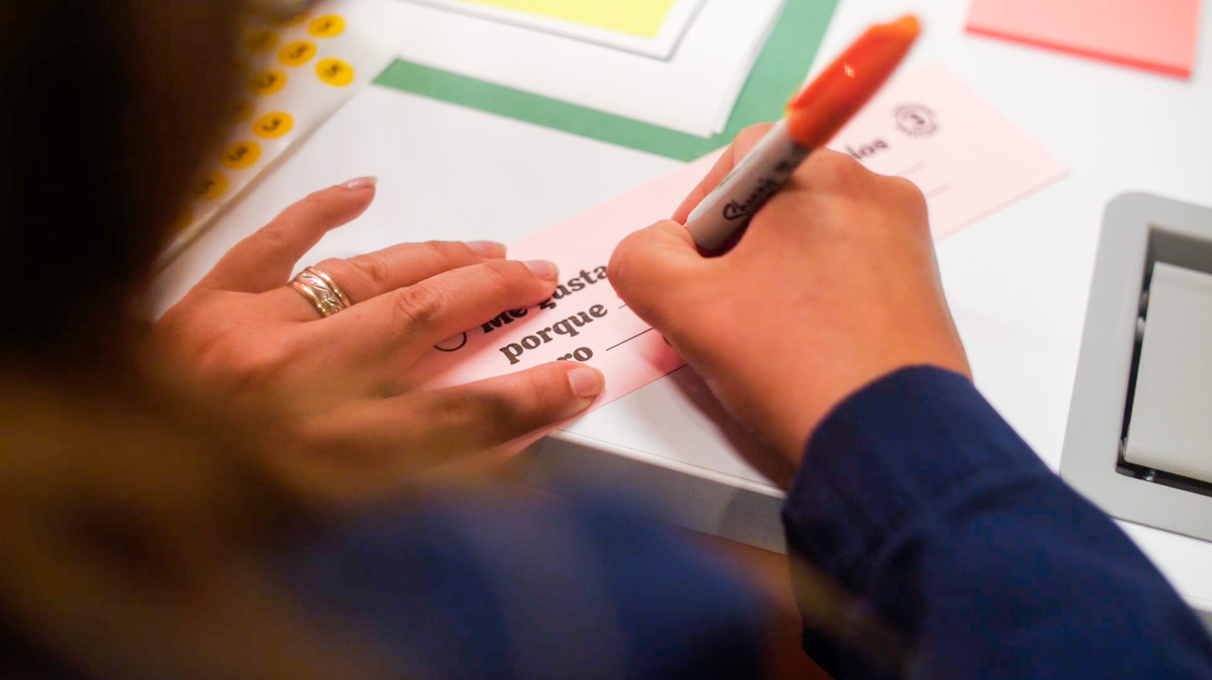
A. Individual questions
Written personal answers to get granular unique details.
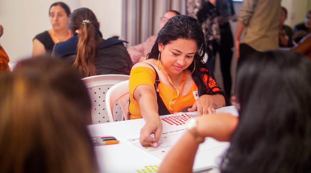
B. Group voting
Dot voting to increase active participation and a sense of common goal.
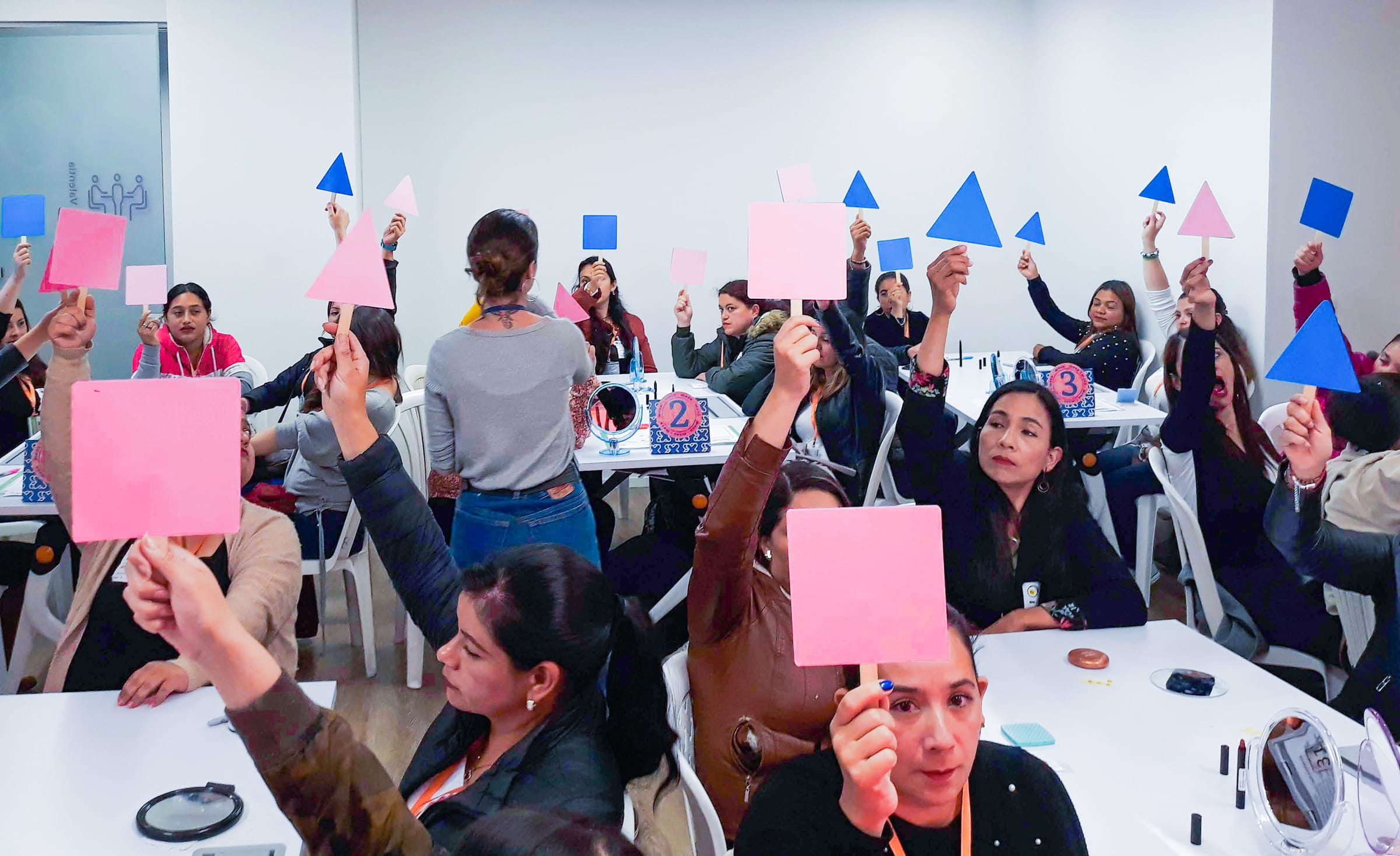
C. Paddle voting
To do small star moments in A/B questions.


Communicating the results
Ingredient 01
Results presentation
We visualised the characteristic of each sample by means of graphs that allowed us to compare the samples in parallel and we structured the result presentation giving importance to women’s opinions through quotes and photos to back up the data we collected.

Ingredient 02
Key insights
With more complex visualizations, we were able to uncover key insights regarding qualitative data gathered during the survey. With these visualizations, we created guides to inspire communication of these products and empathize more with the audience.


Other projects
- Data visualization
- UX/UI
